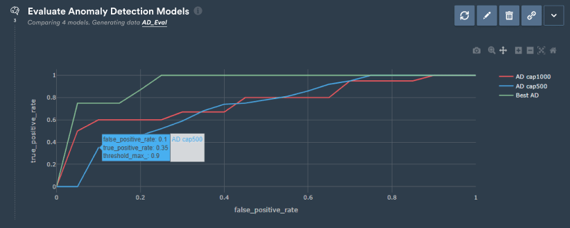
Evaluate Anomaly Detection Models enables to quickly and easily compare multiple Anomaly Detection models. The step will return evaluation data that enables to compare models and identify optimal thresholds.
Often, qualitative and visual evaluation of AD models is not enough to trust models and understand which model has the highest performance for a specific need. Quantitative evaluation is needed to understand the impact of the model and threshold on metrics such as True Positive Rate or False Positive Rate.
In order to use this step, you will need at least one AD model and two datasets: one with non-anomalous data, and a second one with anomalous data. If both types are currently in one dataset only, you can pre-process this dataset in a notebook to split it in two.
Start by selecting the models you want to evaluate. Models don’t need to be trained on the same channels.
Select the non-anomalous data: all tests from this data must be free from anomaly
Select the anomalous data: all tests from this data must be anomalous
Choose which aggregating method you would like to use and on which you want to apply the threshold. If you are not sure which method will be the most appropriate, you can run the step twice to try both methods and identify the best model.
Select whether you want the step to also plot the RoC curves. RoC curves will show for each model the relationship between False Positive Rate and True Positive Rate as the threshold increases from 0 to 1 (more info on how to read RoC curves below).
Finally, you have the option to rename the output data.
Non-anomalous and anomalous data will both need to contain the columns needed by all models to train (time column, series identifier and channels).How to read RoC curves:RoC (Receiver Operating Characteristic) curves visualize the trade-off between the True Positive Rate (TPR) and False Positive Rate (FPR) across different thresholds. A perfect model has a curve that hugs the top-left corner, indicating high TPR and low FPR. The closer the curve is to the diagonal line, the less predictive the model. The area under the curve (AUC) quantifies overall performance, with 1 being perfect and 0.5 indicating no better than random guessing.