Description
Applies an anomaly detection model to a data set and returns the anomaly score for each channel in a raw and aggregated way.Application
Engineers often accumulate a large amount of test data while developing a new product. However, that data needs to be trustworthy before you can use it, and it can sometimes be anomalous, either because the system is behaving in an unexpected way or because the test instrumentation is faulty (for example, a failing sensor). This step, combined with Anomaly Detection Model, gives you a quick, complete assessment of your data’s quality before you rely on it further.How to use
To use this step you need a trained model and a data set in which you want to detect anomalies. The data should satisfy the same requirements needed to train Anomaly Detection Models (see documentation). Once the model and the data are selected, there is one parameter that needs to be defined:Edge trimming | Defines which ratio of each test (in % of steps) should be ignored on the edges when computing the aggregate score. This can be used to remove noise due to edge effects. |
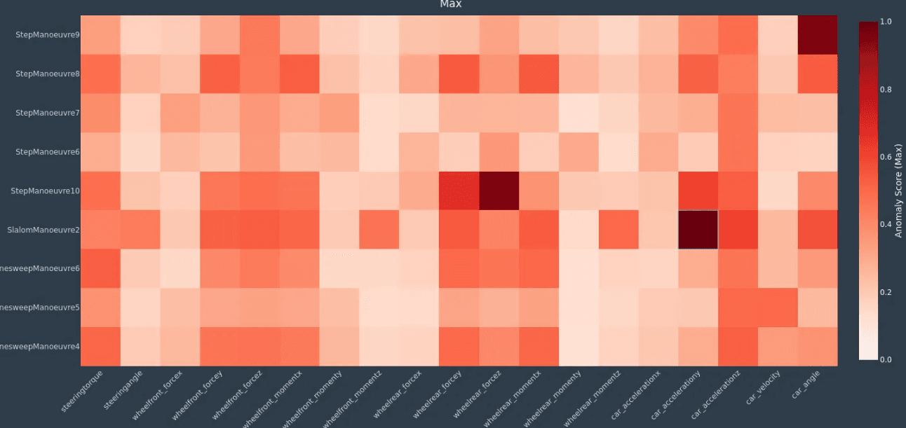
- A heatmap will show the aggregated values for each combination of test (vertical axis) and channel (horizontal axis). The aggregation can be done by taking the mean anomaly score (highlighting prevalent anomalies) or the max anomaly score (highlighting critical anomalies). These two aggregation methods can return very different heat maps.
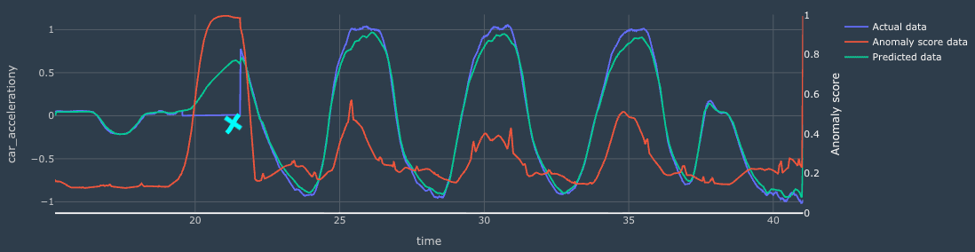
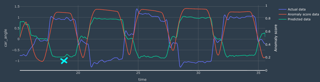
- Any cell of the heatmap can be clicked on. This will display the measured signal of the test-channel combination, as well as the expected (reconstructed) signal and the anomaly signal.
Example
Here is an example where a sensor (car acceleration Y) dropout was highlighted in the heatmap (see blue cross) and displayed in the line plot (see region with high anomaly score).