Visualize trace-level metrics with interactive charts in Weave to explore latency, cost, and token usage patterns for LLM applications.
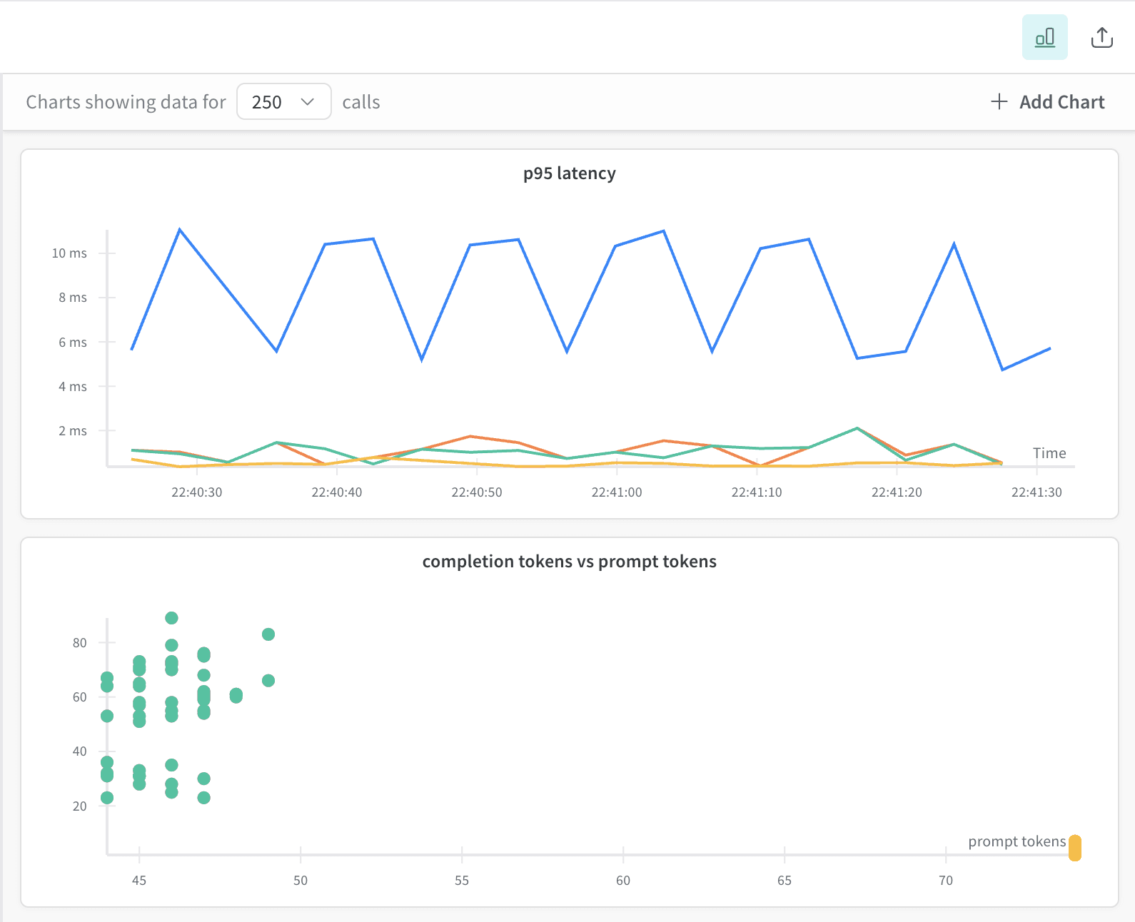
The trace plots tool in Weave lets you explore, visualize, and debug trace-level metrics (for example, latency, cost, and tokens) using interactive charts. You can use the default trace plots or create your own through the custom trace plot builder. This guide shows you how to open the trace plots panel, work with the default plots, and build custom plots tailored to your project’s data.
If the default trace plots don’t show the metrics or relationships you need, you can build your own. To create a custom trace plot, do the following:
From the trace plots side pane, click ➕ Add Chart.
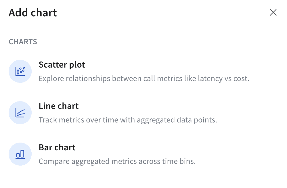
In the pop-up, select one of the available trace plot types:
Configure your trace plot for the selected type. For information on configuration options by trace plot type, see Trace plot settings by plot type.
Click Save chart to save your chart.
Your custom trace plot now appears in the trace plots side pane alongside the default plots and updates dynamically with your trace filters and selections.
When you add or edit a custom trace plot, the available configuration options vary depending on the selected trace plot type. The following table describes the configurable options.