

For instructions about accessing CoreWeave Grafana dashboards, see Access and use CoreWeave Grafana dashboards.
- Spot spikes or drops in throughput that may indicate an incident or a saturation event.
- Correlate traffic behavior with latency (RTT) and connection counts to understand user impact.
- Drill into per-Node or per-service views for focused troubleshooting.
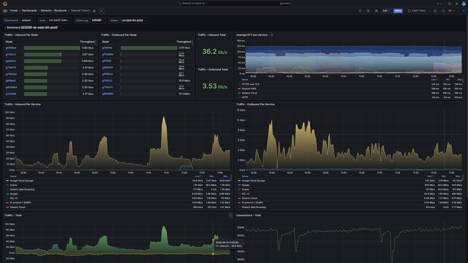
Filters and parameters
Use these filters at the top-left of the page to choose the data you want to view:- Data Source: The Prometheus data source selector.
- Zone: The to view.
- Cluster Org: The organization that owns the cluster.
- Cluster: The specific cluster in the organization to view.
Panel descriptions
The dashboard has several panels with views into the network traffic and connection statistics.| Panel | Description |
|---|---|
| Traffic - Inbound Per Node | A sortable table where each row represents a Node. The Throughput column is rendered as a horizontal gauge, making it easy to see relative utilization at a glance. Click a Node to open the Node Details dashboard for deep-dive analysis. |
| Traffic - Outbound Per Node | The complement to Inbound Per Node, but for egress traffic. This panel is useful for determining which Nodes may require additional bandwidth or rate-limiting. |
| Traffic - Inbound Total | A single card showing the aggregate inbound rate (Gb/s). |
| Traffic - Outbound Total | The complement to Inbound Total, showing the aggregate outbound rate (Gb/s). |
| Average RTT per Service | A time-series graph showing the rolling 5-minute average round-trip time (RTT) for both internal and external paths, grouped by service signature. This panel helps identify latency trends and potential congestion points. |
| Traffic - Inbound Per Service | A stacked-area time-series chart that breaks down inbound traffic by service and categorized by third-party cloud vendors. The legend is interactive, letting you toggle visibility and sort by current throughput, minimum, or maximum. Note: New traffic is labeled (Being analyzed) until it’s processed and categorized. |
| Traffic - Outbound Per Service | The complement to Inbound Per Service, but for egress traffic. This panel is useful for determining which services are generating the most outbound traffic. |
| Traffic - Total | A time-series graph showing the total inbound and outbound traffic. Inbound is shown in green above the X-axis, and outbound is shown in yellow below. Helps visualize the net traffic balance and identify asymmetric patterns. |
| Connections - Total | A time-series graph showing the total number of concurrent connections across all hosts. Helps identify connection flood or drop-off events. |
| Connections - Per Node | A stacked-area time-series chart that breaks down the number of concurrent connections by Node. This helps to identify connection hot spots and potential load-balancing issues. |
| Connections - Per Service | A stacked-area time-series chart that breaks down the number of concurrent connections by service object. This helps to identify which services are holding the most active connections. |
Benefits of this dashboard
The Internet Transit dashboard combines traffic volume, latency, and connection telemetry into a single layout that shows your network’s health. It’s useful for:- Spotting anomalies in traffic patterns, such as sudden spikes or drops that may indicate an incident or saturation event.
- Correlating traffic behavior with latency (RTT) and connection counts to understand user impact.
- Drilling into per-Node or per-service views for focused troubleshooting, letting you quickly identify the source of issues.
- Capacity planning by providing insights into which Nodes or services are under the most load, helping you make informed decisions about scaling and resource allocation.
- Monitoring third-party services to understand how throughput to and from foreign clouds affects your workloads.