

Description
This function allows you to either plot the distribution of a numerical column as a histogram or create a table with the count for each distinct value of a categorical column.Application
If you want to check the distribution of your dataset visually you can use this function to create a histogram for each numerical column in your dataset.How to use
- Select the dataset to analyse in the field Data.
- Select the Columns which shall be analysed. You need to select at least one column and can select as many columns as there are in the selected dataset.
- Select the number of bars or bins which are used in the histogram plots (Number of bars on bar plots). This setting is applied to all plots the function produces. You can’t change this setting for single plots.
 Histogram with 100 bars |  Same data but plotted with only 40 bars |
- If you enable the option Show statistics, the Median and the Mean value of the distribution are shown in the plots as white bars. This only works for numerical columns.
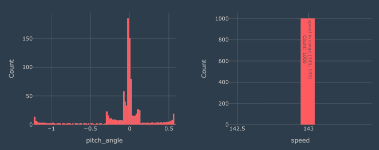 | 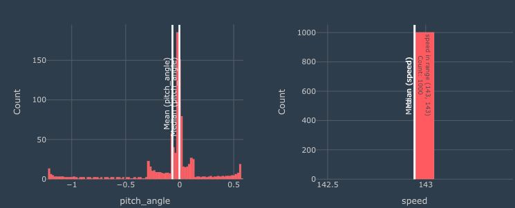 |
- For finer control over how a numerical column is split into bars, enable Show advanced options to reveal the Custom bin edges field (see the section below).
- Click Apply to run the analysis and generate the plots.
Advanced Options
Custom bin edges
By default the histogram uses uniform-width bars determined by the Number of bars on bar plots setting. If your data is unevenly distributed (for example clustered around a few values with a few far outliers), you can specify your own bin boundaries instead, producing a variable-width histogram that focuses detail where you need it.- Enable Show advanced options at the bottom of the step settings to reveal the Custom bin edges field.
- Type a comma-separated, strictly-increasing list of numbers, for example
0, 1, 5, 25, 100. - One bar is drawn between every consecutive pair of edges. The first bar includes both end values; subsequent bars include only the right-hand value.
- Values that fall outside the first or last edge are excluded from the plot. The x-axis is pinned to the range you typed, with a tick label at every edge you entered.
- While Custom bin edges is set, the Number of bars on bar plots value is ignored.
- Custom bin edges only applies to numerical columns. If a categorical column is also selected the step will not run and will explain the rule in an error message. Remove the categorical column to proceed.
Tip: Custom bin edges are particularly useful when your dataset has a few extreme values that stretch the x-axis on the default histogram, or when you want bar boundaries that line up with meaningful thresholds in your analysis (for example temperature limits, pressure tolerance bands, or test-rig operating ranges).
Examples
The plots above are the result if a column contains numerical data. These plots show the distribution of the parameterultimate strain.
The Distribution manipulator can also be used to tabulate the distribution of categorical columns, such as carbon fibre and glass fibre, below.
 |  |