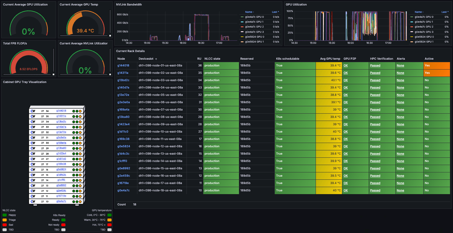
The Cabinet Visualizer dashboard displays statistics and historical data for each cabinet, including its cooling system and enclosed rack. You can monitor overall cabinet health and view detailed information about each Node to identify issues and track performance trends over time.
This dashboard is useful for monitoring the health of GB200 and GB300 NVL72-powered Node Pools and their individual Nodes, since they’re deployed only as full racks in dedicated cabinets.
The Cabinet Visualizer dashboard includes sections for aggregate statistics, GPU tray visualization, time-series graphs, and rack details. Each section provides different insights into the cabinet’s performance and health.
This panel on the lower left shows a visual layout of the enclosed rack, with each Node labeled by name. Color coding indicates the Node’s NLCC state, Kubernetes state, and GPU temperature. Hover over any indicator for more details, or click a Node to view its full status.Refer to the legend at the bottom of the panel to interpret the color codes.
These panels on the upper right show time-series graphs for aggregate NVLink bandwidth and GPU utilization across the cabinet. Use them to monitor performance trends and detect anomalies. Hover over any graph to view detailed data points. Use the list of Nodes beside each graph to filter the data by individual Node.
GPU P2P shows the peer-to-peer communication status between GPUs on the Node. This is required for any form of NVLink communication, both intra- and inter-tray.
OK: The GPUs peer correctly.
X: The GPU peers with itself. This is ignored.
NS: not supported
HPC Verification
Result of the most recent HPC (High Performance Computing) validation checks run on the Node.
Passed: The most recent run completed successfully.
Failed: The most recent run failed.
Not Run: A check hasn’t run yet. This is common for newly delivered Nodes in a CKS cluster, since the verification data is stored on the Kubernetes host, not the Node itself.
Alerts
Alert status for the Node.
None
Pending
Firing
Active
Whether the Node is currently running a workload Pod that is neither interruptible nor part of a DaemonSet.