> ## Documentation Index
> Fetch the complete documentation index at: https://docs.coreweave.com/llms.txt
> Use this file to discover all available pages before exploring further.
# Internet transit
> Monitor your Node and service-level traffic and connection statistics.
The **Internet Transit** dashboard provides a near-real-time view into how much traffic flows through your backbone egress and ingress points, how that traffic is distributed across internal services, and how well the network is performing from an end-user perspective. Use this dashboard to monitor Node and service-level traffic and connection statistics so you can detect incidents, plan capacity, and troubleshoot network issues.
To view the dashboard, go to the [Internet Transit dashboard](https://cks-grafana.coreweave.com/d/ce3pbkpbkhn9cd/internet-transit).
For instructions about accessing CoreWeave Grafana dashboards, see [Access and use CoreWeave Grafana dashboards](/observability/managed-grafana/access).
 By default, the panels refresh every minute with a 5-minute time window. You can adjust both of these at the top-right of the dashboard.
You can use this dashboard to:
* Spot spikes or drops in throughput that may indicate an incident or a saturation event.
* Correlate traffic behavior with latency (RTT) and connection counts to understand user impact.
* Drill into per-Node or per-service views for focused troubleshooting.
## Filters and parameters
Use these filters at the top-left of the page to choose the data you want to view:
* **Data Source**: The Prometheus data source selector.
* **Zone**: The Availability Zone (AZ) to view.
* **Cluster Org**: The organization that owns the cluster.
* **Cluster**: The specific cluster in the organization to view.
Set the time range and refresh rate parameters at the top-right of the page. The default time range is 5 minutes, and the default refresh rate is 1 minute.
## Panel descriptions
The dashboard has several panels with views into the network traffic and connection statistics.
| Panel | Description |
| ---------------------------------- | ----------------------------------------------------------------------------------------------------------------------------------------------------------------------------------------------------------------------------------------------------------------------------------------------------------------------------------------- |
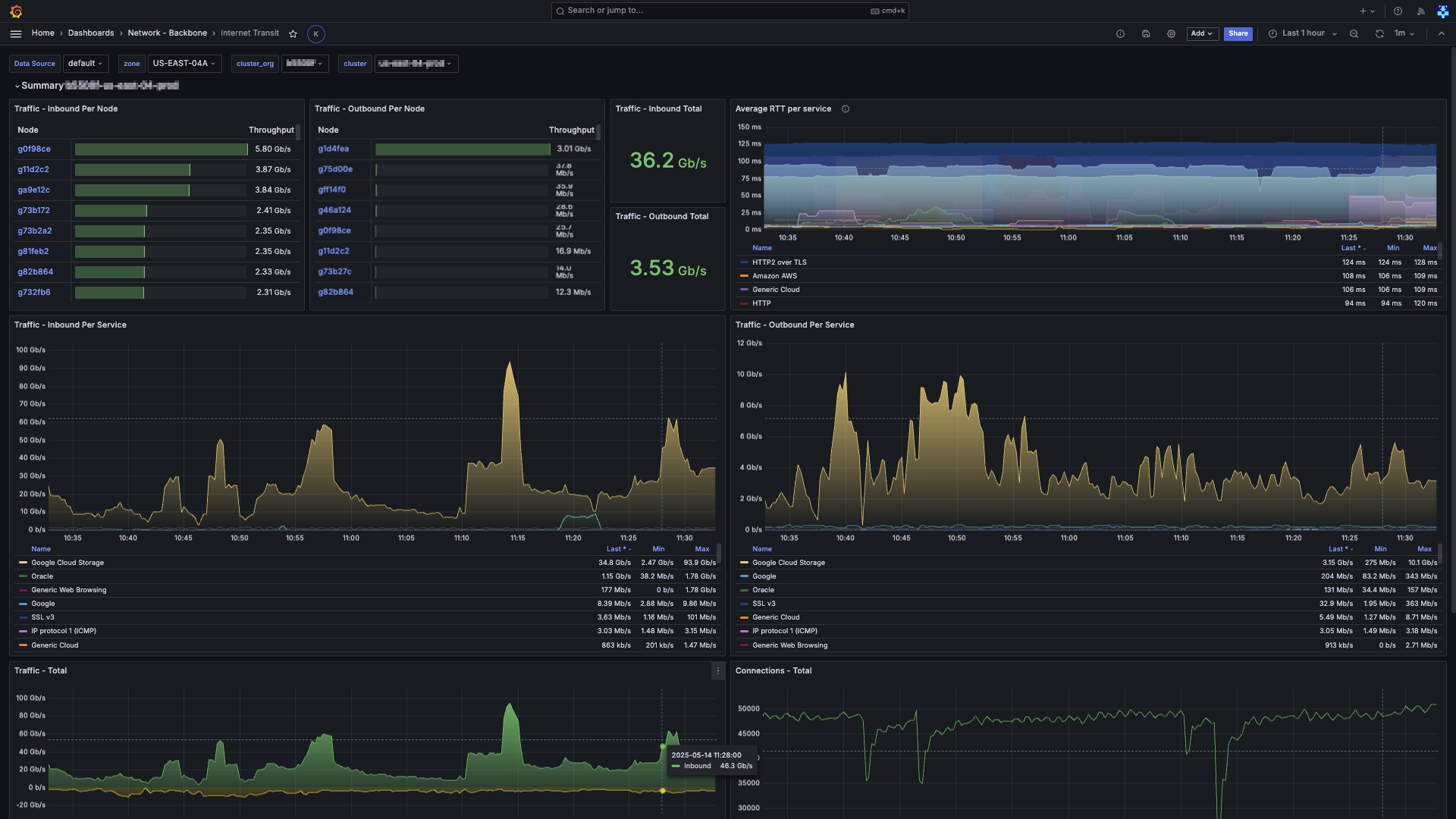
| **Traffic - Inbound Per Node** | A sortable table where each row represents a Node. The **Throughput** column is rendered as a horizontal gauge, making it easy to see relative utilization at a glance. Click a Node to open the **Node Details** dashboard for deep-dive analysis. |
| **Traffic - Outbound Per Node** | The complement to **Inbound Per Node**, but for egress traffic. This panel is useful for determining which Nodes may require additional bandwidth or rate-limiting. |
| **Traffic - Inbound Total** | A single card showing the aggregate inbound rate (Gb/s). |
| **Traffic - Outbound Total** | The complement to **Inbound Total**, showing the aggregate outbound rate (Gb/s). |
| **Average RTT per Service** | A time-series graph showing the rolling 5-minute average round-trip time (RTT) for both internal and external paths, grouped by service signature. This panel helps identify latency trends and potential congestion points. |
| **Traffic - Inbound Per Service** | A stacked-area time-series chart that breaks down inbound traffic by service and categorized by third-party cloud vendors. The legend is interactive, letting you toggle visibility and sort by current throughput, minimum, or maximum.
By default, the panels refresh every minute with a 5-minute time window. You can adjust both of these at the top-right of the dashboard.
You can use this dashboard to:
* Spot spikes or drops in throughput that may indicate an incident or a saturation event.
* Correlate traffic behavior with latency (RTT) and connection counts to understand user impact.
* Drill into per-Node or per-service views for focused troubleshooting.
## Filters and parameters
Use these filters at the top-left of the page to choose the data you want to view:
* **Data Source**: The Prometheus data source selector.
* **Zone**: The Availability Zone (AZ) to view.
* **Cluster Org**: The organization that owns the cluster.
* **Cluster**: The specific cluster in the organization to view.
Set the time range and refresh rate parameters at the top-right of the page. The default time range is 5 minutes, and the default refresh rate is 1 minute.
## Panel descriptions
The dashboard has several panels with views into the network traffic and connection statistics.
| Panel | Description |
| ---------------------------------- | ----------------------------------------------------------------------------------------------------------------------------------------------------------------------------------------------------------------------------------------------------------------------------------------------------------------------------------------- |
| **Traffic - Inbound Per Node** | A sortable table where each row represents a Node. The **Throughput** column is rendered as a horizontal gauge, making it easy to see relative utilization at a glance. Click a Node to open the **Node Details** dashboard for deep-dive analysis. |
| **Traffic - Outbound Per Node** | The complement to **Inbound Per Node**, but for egress traffic. This panel is useful for determining which Nodes may require additional bandwidth or rate-limiting. |
| **Traffic - Inbound Total** | A single card showing the aggregate inbound rate (Gb/s). |
| **Traffic - Outbound Total** | The complement to **Inbound Total**, showing the aggregate outbound rate (Gb/s). |
| **Average RTT per Service** | A time-series graph showing the rolling 5-minute average round-trip time (RTT) for both internal and external paths, grouped by service signature. This panel helps identify latency trends and potential congestion points. |
| **Traffic - Inbound Per Service** | A stacked-area time-series chart that breaks down inbound traffic by service and categorized by third-party cloud vendors. The legend is interactive, letting you toggle visibility and sort by current throughput, minimum, or maximum.
**Note**: New traffic is labeled **(Being analyzed)** until it's processed and categorized. |
| **Traffic - Outbound Per Service** | The complement to **Inbound Per Service**, but for egress traffic. This panel is useful for determining which services are generating the most outbound traffic. |
| **Traffic - Total** | A time-series graph showing the total inbound and outbound traffic. Inbound is shown in green above the X-axis, and outbound is shown in yellow below. Helps visualize the net traffic balance and identify asymmetric patterns. |
| **Connections - Total** | A time-series graph showing the total number of concurrent connections across all hosts. Helps identify connection flood or drop-off events. |
| **Connections - Per Node** | A stacked-area time-series chart that breaks down the number of concurrent connections by Node. This helps to identify connection hot spots and potential load-balancing issues. |
| **Connections - Per Service** | A stacked-area time-series chart that breaks down the number of concurrent connections by service object. This helps to identify which services are holding the most active connections. |
## Benefits of this dashboard
The **Internet Transit** dashboard combines traffic volume, latency, and connection telemetry into a single layout that shows your network's health. It's useful for:
* **Spotting anomalies** in traffic patterns, such as sudden spikes or drops that may indicate an incident or saturation event.
* **Correlating traffic behavior** with latency (RTT) and connection counts to understand user impact.
* **Drilling into per-Node or per-service views** for focused troubleshooting, letting you quickly identify the source of issues.
* **Capacity planning** by providing insights into which Nodes or services are under the most load, helping you make informed decisions about scaling and resource allocation.
* **Monitoring third-party services** to understand how throughput to and from foreign clouds affects your workloads.
Together, these capabilities shorten the time required to detect network issues, guide capacity planning, and improve end-user experience.
## Related dashboards
For broader visibility into your network, see the related backbone dashboards.
### Network - Backbone dashboards
The **[Network - Backbone dashboards](https://cks-grafana.coreweave.com/dashboards/f/fekdoxwp6ld6oe/network-backbone)** provide insight into the state of your network, including traffic metrics, connection counts, and latency.
### Internet transit
The Internet Transit dashboard provides a near-real-time view into how much traffic flows through your backbone egress and ingress points, how that traffic is distributed across internal services, and how well the network is performing from an end-user perspective.