> ## Documentation Index
> Fetch the complete documentation index at: https://docs.coreweave.com/llms.txt
> Use this file to discover all available pages before exploring further.
> 機械学習の実験からプロットを作成してトラッキングします。
# 実験からプロットを作成してトラッキングする
W\&B Models では、`wandb.plot` のメソッドと `wandb.Run.log()` を使って、トレーニング中に時間とともに変化するチャートを含め、さまざまなチャートをトラッキングできます。カスタム チャートのフレームワークについて詳しくは、[カスタム チャートのウォークスルー](/ja/products/wandb/app/features/custom-charts/walkthrough)を参照してください。
基本的なチャート
W\&B のチャートを作成するには、次の手順を実行します。
1. `wandb.Table` オブジェクトを作成し、可視化したいデータを追加します。
2. W\&B に組み込まれている[ヘルパー関数](/ja/products/wandb/ref/python/custom-charts)のいずれかを使用して、プロットを生成します。
3. `wandb.Run.log()` でプロットをログします。
以下の基本的なチャートを使用すると、メトリクスや結果をシンプルに可視化できます。
カスタム折れ線グラフをログします。カスタム折れ線グラフは、任意の軸上に配置された、順序付きで互いに接続されたポイントのリストです。
```python theme={"system"}
import wandb
with wandb.init() as run:
data = [[x, y] for (x, y) in zip(x_values, y_values)]
table = wandb.Table(data=data, columns=["x", "y"])
run.log(
{
"my_custom_plot_id": wandb.plot.line(
table, "x", "y", title="Custom Y versus X line plot"
)
}
)
```
これを使用すると、任意の 2 つの次元で曲線をログできます。2 つの値のリストを対応させてプロットする場合は、両方のリストの値の数が完全に一致している必要があります。たとえば、各ポイントには x と y の両方が必要です。
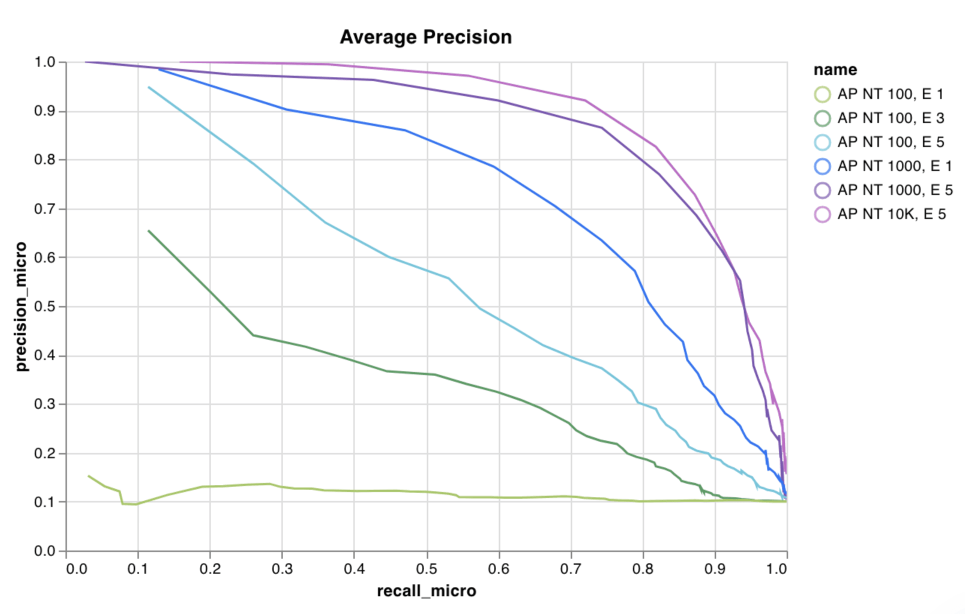 詳細については、report「[Creating Custom Line Plots With W\&B](https://forge.coreweave.com/wandb/wandb/plots/reports/Custom-Line-Plots--VmlldzoyNjk5NTA)」を参照してください。
[コードを実行する](https://tiny.cc/custom-charts)
カスタム散布図をログします。カスタム散布図は、任意の 2 つの軸 x と y 上にプロットしたポイント (x, y) のリストです。
```python theme={"system"}
import wandb
with wandb.init() as run:
data = [[x, y] for (x, y) in zip(class_x_scores, class_y_scores)]
table = wandb.Table(data=data, columns=["class_x", "class_y"])
run.log({"my_custom_id": wandb.plot.scatter(table, "class_x", "class_y")})
```
これを使用すると、任意の 2 つの次元で散布図のポイントをログできます。2 つの値のリストを互いに対してプロットする場合、両方のリストの値の数が完全に一致している必要があります。たとえば、各ポイントには x と y の両方が必要です。
詳細については、report「[Creating Custom Line Plots With W\&B](https://forge.coreweave.com/wandb/wandb/plots/reports/Custom-Line-Plots--VmlldzoyNjk5NTA)」を参照してください。
[コードを実行する](https://tiny.cc/custom-charts)
カスタム散布図をログします。カスタム散布図は、任意の 2 つの軸 x と y 上にプロットしたポイント (x, y) のリストです。
```python theme={"system"}
import wandb
with wandb.init() as run:
data = [[x, y] for (x, y) in zip(class_x_scores, class_y_scores)]
table = wandb.Table(data=data, columns=["class_x", "class_y"])
run.log({"my_custom_id": wandb.plot.scatter(table, "class_x", "class_y")})
```
これを使用すると、任意の 2 つの次元で散布図のポイントをログできます。2 つの値のリストを互いに対してプロットする場合、両方のリストの値の数が完全に一致している必要があります。たとえば、各ポイントには x と y の両方が必要です。
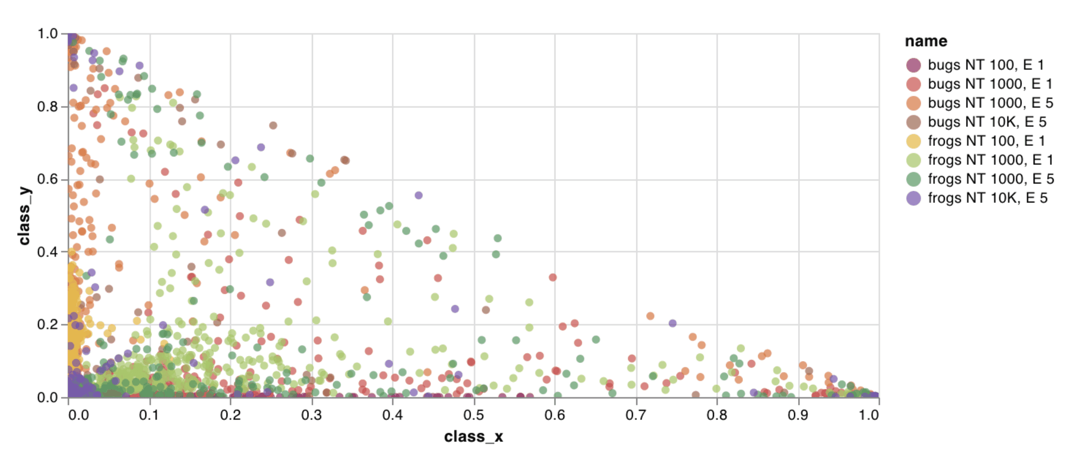 詳細については、report「[Creating Custom Scatter Plots With W\&B](https://forge.coreweave.com/wandb/wandb/plots/reports/Custom-Scatter-Plots--VmlldzoyNjk5NDQ)」を参照してください。
[コードを実行する](https://tiny.cc/custom-charts)
カスタム棒グラフ (ラベル付きの値のリストを棒で表したもの) は、わずか数行のコードでネイティブにログできます:
```python theme={"system"}
import wandb
with wandb.init() as run:
data = [[label, val] for (label, val) in zip(labels, values)]
table = wandb.Table(data=data, columns=["label", "value"])
run.log(
{
"my_bar_chart_id": wandb.plot.bar(
table, "label", "value", title="Custom bar chart"
)
}
)
```
これを使用すると、任意の棒グラフをログできます。リスト内のラベルと値の数は正確に一致している必要があります。各データポイントには、ラベルと値の両方が必要です。
詳細については、report「[Creating Custom Scatter Plots With W\&B](https://forge.coreweave.com/wandb/wandb/plots/reports/Custom-Scatter-Plots--VmlldzoyNjk5NDQ)」を参照してください。
[コードを実行する](https://tiny.cc/custom-charts)
カスタム棒グラフ (ラベル付きの値のリストを棒で表したもの) は、わずか数行のコードでネイティブにログできます:
```python theme={"system"}
import wandb
with wandb.init() as run:
data = [[label, val] for (label, val) in zip(labels, values)]
table = wandb.Table(data=data, columns=["label", "value"])
run.log(
{
"my_bar_chart_id": wandb.plot.bar(
table, "label", "value", title="Custom bar chart"
)
}
)
```
これを使用すると、任意の棒グラフをログできます。リスト内のラベルと値の数は正確に一致している必要があります。各データポイントには、ラベルと値の両方が必要です。
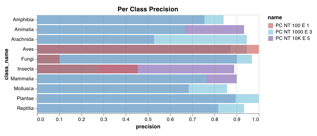 詳細については、[Custom Bar Charts](https://forge.coreweave.com/wandb/wandb/plots/reports/Custom-Bar-Charts--VmlldzoyNzExNzk) report を参照してください。
[コードを実行する](https://tiny.cc/custom-charts)
カスタムヒストグラム (値のリストを出現回数または頻度に応じてビンに分けたもの) は、わずか数行でネイティブにログできます。予測の信頼度スコアのリスト (`scores`) がある場合は、次のように分布を可視化できます。
```python theme={"system"}
import wandb
with wandb.init() as run:
data = [[s] for s in scores]
table = wandb.Table(data=data, columns=["scores"])
run.log({"my_histogram": wandb.plot.histogram(table, "scores", title="Histogram")})
```
これを使用すると、任意のヒストグラムをログできます。`data` はリストのリストで、行と列から成る 2 次元配列を扱えるようになっています。
詳細については、[Custom Bar Charts](https://forge.coreweave.com/wandb/wandb/plots/reports/Custom-Bar-Charts--VmlldzoyNzExNzk) report を参照してください。
[コードを実行する](https://tiny.cc/custom-charts)
カスタムヒストグラム (値のリストを出現回数または頻度に応じてビンに分けたもの) は、わずか数行でネイティブにログできます。予測の信頼度スコアのリスト (`scores`) がある場合は、次のように分布を可視化できます。
```python theme={"system"}
import wandb
with wandb.init() as run:
data = [[s] for s in scores]
table = wandb.Table(data=data, columns=["scores"])
run.log({"my_histogram": wandb.plot.histogram(table, "scores", title="Histogram")})
```
これを使用すると、任意のヒストグラムをログできます。`data` はリストのリストで、行と列から成る 2 次元配列を扱えるようになっています。
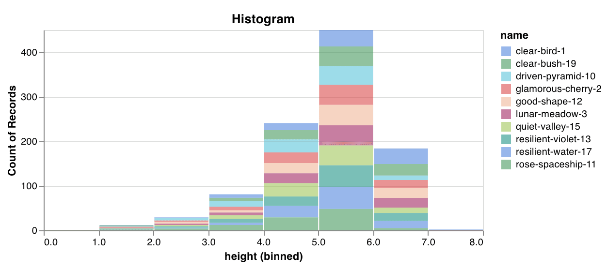 詳細については、[Creating Custom Histograms With W\&B](https://forge.coreweave.com/wandb/wandb/plots/reports/Custom-Histograms--VmlldzoyNzE0NzM) report を参照してください。
[コードを実行する](https://tiny.cc/custom-charts)
複数の線 (x-y 座標ペアの異なるリストを複数) を、共通の x-y 軸上にまとめてプロットします:
```python theme={"system"}
import wandb
with wandb.init() as run:
run.log(
{
"my_custom_id": wandb.plot.line_series(
xs=[0, 1, 2, 3, 4],
ys=[[10, 20, 30, 40, 50], [0.5, 11, 72, 3, 41]],
keys=["metric Y", "metric Z"],
title="Two Random Metrics",
xname="x units",
)
}
)
```
x と y のポイント数は完全に一致している必要があります。1 つの x 値のリストを複数の y 値のリストに共通で使用することも、y 値のリストごとに個別の x 値のリストを指定することもできます。
詳細については、[Creating Custom Histograms With W\&B](https://forge.coreweave.com/wandb/wandb/plots/reports/Custom-Histograms--VmlldzoyNzE0NzM) report を参照してください。
[コードを実行する](https://tiny.cc/custom-charts)
複数の線 (x-y 座標ペアの異なるリストを複数) を、共通の x-y 軸上にまとめてプロットします:
```python theme={"system"}
import wandb
with wandb.init() as run:
run.log(
{
"my_custom_id": wandb.plot.line_series(
xs=[0, 1, 2, 3, 4],
ys=[[10, 20, 30, 40, 50], [0.5, 11, 72, 3, 41]],
keys=["metric Y", "metric Z"],
title="Two Random Metrics",
xname="x units",
)
}
)
```
x と y のポイント数は完全に一致している必要があります。1 つの x 値のリストを複数の y 値のリストに共通で使用することも、y 値のリストごとに個別の x 値のリストを指定することもできます。
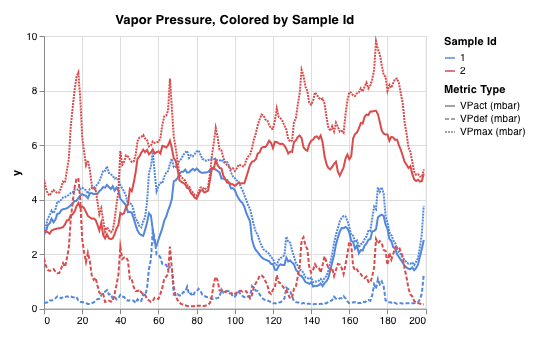 詳しくは、[Custom Multi-Line Plots](https://forge.coreweave.com/wandb/wandb/plots/reports/Custom-Multi-Line-Plots--VmlldzozOTMwMjU) report を参照してください。
モデル評価チャート
これらのプリセットチャートには `wandb.plot()` メソッドが組み込まれているため、スクリプトから直接チャートをすばやくログし、必要な情報を UI で的確に確認できます。
[適合率-再現率曲線 (Precision-Recall curve)](https://scikit-learn.org/stable/modules/generated/sklearn.metrics.precision_recall_curve.html#sklearn.metrics.precision_recall_curve) は 1 行で作成できます。
```python theme={"system"}
import wandb
with wandb.init() as run:
# ground_truth は正解ラベルのリスト、predictions は予測スコアのリストです。
# 例: ground_truth = [0, 1, 1, 0]、predictions = [0.1, 0.4, 0.35, 0.8]
ground_truth = [0, 1, 1, 0]
predictions = [0.1, 0.4, 0.35, 0.8]
run.log({"pr": wandb.plot.pr_curve(ground_truth, predictions)})
```
コードから次の情報にアクセスできる場合は、いつでもこれをログできます。
* 一連のサンプルに対するモデルの予測スコア (`predictions`) 。
* それらのサンプルに対応する正解ラベル (`ground_truth`) 。
* (オプション) ラベル名またはクラス名のリスト。たとえば、ラベルのインデックス 0 が猫、1 が犬、2 が鳥を表す場合は `labels=["cat", "dog", "bird"]` と指定します。
* (オプション) プロットで可視化するラベルのサブセット (リスト形式で指定) 。
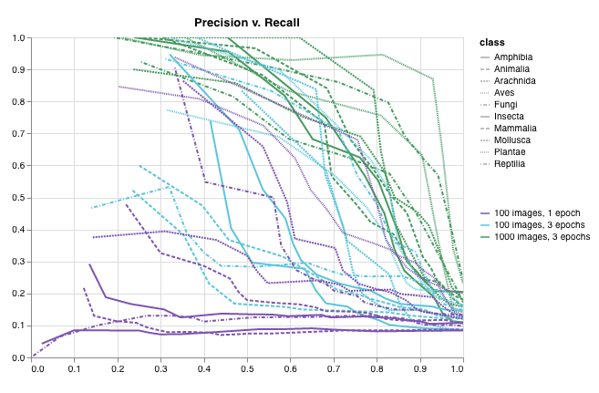 詳細については、[Plot Precision Recall Curves With W\&B](https://forge.coreweave.com/wandb/wandb/plots/reports/Plot-Precision-Recall-Curves--VmlldzoyNjk1ODY) report を参照してください。
[コードを実行する](https://colab.research.google.com/drive/1mS8ogA3LcZWOXchfJoMrboW3opY1A8BY?usp=sharing)
[ROC 曲線](https://scikit-learn.org/stable/modules/generated/sklearn.metrics.roc_curve.html#sklearn.metrics.roc_curve)は 1 行で作成できます:
```python theme={"system"}
import wandb
with wandb.init() as run:
# ground_truth は正解ラベルのリスト、predictions は予測スコアのリストです。
# 例: ground_truth = [0, 1, 1, 0]、predictions = [0.1, 0.4, 0.35, 0.8]
ground_truth = [0, 1, 1, 0]
predictions = [0.1, 0.4, 0.35, 0.8]
run.log({"roc": wandb.plot.roc_curve(ground_truth, predictions)})
```
コードから次の情報にアクセスできる場合は、いつでもこれをログできます。
* 一連のサンプルに対するモデルの予測スコア (`predictions`) 。
* それらのサンプルに対応する正解ラベル (`ground_truth`) 。
* (オプション) ラベル名またはクラス名のリスト。たとえば、ラベルのインデックス 0 が cat、1 が dog、2 が bird を表す場合は `labels=["cat", "dog", "bird"]` と指定します。
* (オプション) プロットで可視化する、これらのラベルのサブセット (リスト形式のまま指定) 。
詳細については、[Plot Precision Recall Curves With W\&B](https://forge.coreweave.com/wandb/wandb/plots/reports/Plot-Precision-Recall-Curves--VmlldzoyNjk1ODY) report を参照してください。
[コードを実行する](https://colab.research.google.com/drive/1mS8ogA3LcZWOXchfJoMrboW3opY1A8BY?usp=sharing)
[ROC 曲線](https://scikit-learn.org/stable/modules/generated/sklearn.metrics.roc_curve.html#sklearn.metrics.roc_curve)は 1 行で作成できます:
```python theme={"system"}
import wandb
with wandb.init() as run:
# ground_truth は正解ラベルのリスト、predictions は予測スコアのリストです。
# 例: ground_truth = [0, 1, 1, 0]、predictions = [0.1, 0.4, 0.35, 0.8]
ground_truth = [0, 1, 1, 0]
predictions = [0.1, 0.4, 0.35, 0.8]
run.log({"roc": wandb.plot.roc_curve(ground_truth, predictions)})
```
コードから次の情報にアクセスできる場合は、いつでもこれをログできます。
* 一連のサンプルに対するモデルの予測スコア (`predictions`) 。
* それらのサンプルに対応する正解ラベル (`ground_truth`) 。
* (オプション) ラベル名またはクラス名のリスト。たとえば、ラベルのインデックス 0 が cat、1 が dog、2 が bird を表す場合は `labels=["cat", "dog", "bird"]` と指定します。
* (オプション) プロットで可視化する、これらのラベルのサブセット (リスト形式のまま指定) 。
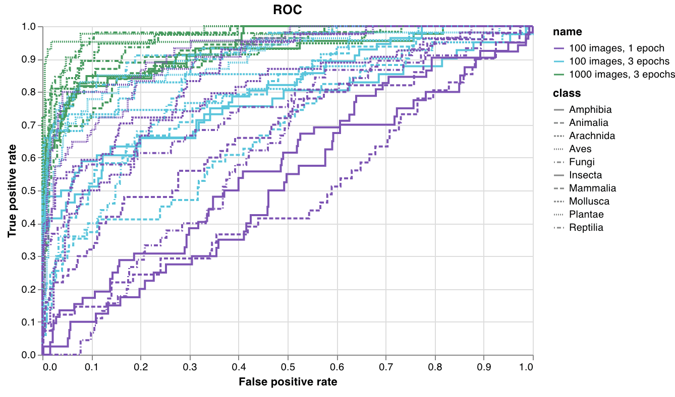 詳細については、[Plot ROC Curves With W\&B](https://forge.coreweave.com/wandb/wandb/plots/reports/Plot-ROC-Curves--VmlldzoyNjk3MDE) report を参照してください。
[コードを実行する](https://colab.research.google.com/github/wandb/examples/blob/master/colabs/wandb-log/Plot_ROC_Curves_with_W%26B.ipynb)
多クラスの[混同行列](https://scikit-learn.org/stable/auto_examples/model_selection/plot_confusion_matrix.html)を 1 行で作成します:
```python theme={"system"}
import wandb
cm = wandb.plot.confusion_matrix(
y_true=ground_truth, preds=predictions, class_names=class_names
)
with wandb.init() as run:
run.log({"conf_mat": cm})
```
コードから次の情報にアクセスできる場所であれば、どこでもこれをログできます。
* 一連のサンプルに対するモデルの予測ラベル (`preds`) 、または正規化された確率スコア (`probs`) 。確率の形状は (サンプル数, クラス数) である必要があります。確率と予測はどちらか一方のみを指定でき、両方を指定することはできません。
* それらのサンプルに対応する正解ラベル (`y_true`) 。
* `class_names` に strings として指定する、ラベル名またはクラス名の完全なリスト。たとえば、インデックス 0 が `cat`、1 が `dog`、2 が `bird` の場合は `class_names=["cat", "dog", "bird"]` とします。
詳細については、[Plot ROC Curves With W\&B](https://forge.coreweave.com/wandb/wandb/plots/reports/Plot-ROC-Curves--VmlldzoyNjk3MDE) report を参照してください。
[コードを実行する](https://colab.research.google.com/github/wandb/examples/blob/master/colabs/wandb-log/Plot_ROC_Curves_with_W%26B.ipynb)
多クラスの[混同行列](https://scikit-learn.org/stable/auto_examples/model_selection/plot_confusion_matrix.html)を 1 行で作成します:
```python theme={"system"}
import wandb
cm = wandb.plot.confusion_matrix(
y_true=ground_truth, preds=predictions, class_names=class_names
)
with wandb.init() as run:
run.log({"conf_mat": cm})
```
コードから次の情報にアクセスできる場所であれば、どこでもこれをログできます。
* 一連のサンプルに対するモデルの予測ラベル (`preds`) 、または正規化された確率スコア (`probs`) 。確率の形状は (サンプル数, クラス数) である必要があります。確率と予測はどちらか一方のみを指定でき、両方を指定することはできません。
* それらのサンプルに対応する正解ラベル (`y_true`) 。
* `class_names` に strings として指定する、ラベル名またはクラス名の完全なリスト。たとえば、インデックス 0 が `cat`、1 が `dog`、2 が `bird` の場合は `class_names=["cat", "dog", "bird"]` とします。
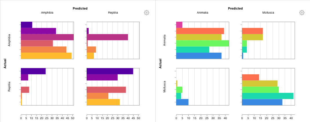 詳細については、[Confusion Matrix: Usage and Examples](https://forge.coreweave.com/wandb/wandb/plots/reports/Confusion-Matrix--VmlldzozMDg1NTM) report を参照してください。
[コードを実行する](https://colab.research.google.com/github/wandb/examples/blob/master/colabs/wandb-log/Log_a_Confusion_Matrix_with_W%26B.ipynb)
詳細については、[Confusion Matrix: Usage and Examples](https://forge.coreweave.com/wandb/wandb/plots/reports/Confusion-Matrix--VmlldzozMDg1NTM) report を参照してください。
[コードを実行する](https://colab.research.google.com/github/wandb/examples/blob/master/colabs/wandb-log/Log_a_Confusion_Matrix_with_W%26B.ipynb)
インタラクティブなカスタム チャート
チャートを自由にカスタマイズするには、組み込みの[カスタム チャート プリセット](/ja/products/wandb/app/features/custom-charts/walkthrough)を調整するか新しいプリセットを作成し、チャートを保存します。そのチャート ID を使用すると、スクリプトからそのカスタム プリセットに直接データをログできます。
```python theme={"system"}
import wandb
# プロットする列を含む表を作成します。
table = wandb.Table(data=data, columns=["step", "height"])
# 表の列をチャートのフィールドにマッピングします。
fields = {"x": "step", "value": "height"}
# 表のデータを新しいカスタム チャート プリセットに渡します。
# 自分で保存したチャート プリセットを使用するには、vega_spec_name を変更します。
# タイトルを編集するには、string_fields を変更します。
my_custom_chart = wandb.plot_table(
vega_spec_name="carey/new_chart",
data_table=table,
fields=fields,
string_fields={"title": "Height Histogram"},
)
with wandb.init() as run:
# カスタム チャートをログします。
run.log({"my_custom_chart": my_custom_chart})
```
[コードを実行する](https://tiny.cc/custom-charts)
Matplotlib と Plotly のプロット
`wandb.plot()` で W\&B の [カスタム チャート](/ja/products/wandb/app/features/custom-charts/walkthrough) を使う代わりに、[matplotlib](https://matplotlib.org/) や [Plotly](https://plotly.com/) で生成したチャートをログすることもできます。
```python theme={"system"}
import wandb
import matplotlib.pyplot as plt
with wandb.init() as run:
# 簡単な matplotlib のプロットを作成します。
plt.figure()
plt.plot([1, 2, 3, 4])
plt.ylabel("some interesting numbers")
# プロットを W&B にログします。
run.log({"chart": plt})
```
`matplotlib` のプロットまたは figure オブジェクトを `wandb.Run.log()` に渡します。デフォルトでは、プロットは [Plotly](https://plot.ly/) のプロットに変換されます。プロットを画像としてログしたい場合は、プロットを `wandb.Image` に渡してください。Plotly のチャートをそのまま渡すこともできます。
「You attempted to log an empty plot」のようなエラーが発生した場合は、`fig = plt.figure()` で figure をプロットとは別に保持し、`wandb.Run.log()` の呼び出しで `fig` をログしてください。
カスタム HTML を W\&B 表にログする
W\&B では、Plotly や Bokeh で作成したインタラクティブなチャートを HTML としてログし、Tables に追加できます。
インタラクティブな Plotly チャートは、HTML に変換することで W\&B 表にログできます。
```python theme={"system"}
import wandb
import plotly.express as px
# 新しい run を初期化します。
with wandb.init(project="log-plotly-fig-tables", name="plotly_html") as run:
# 表を作成します。
table = wandb.Table(columns=["plotly_figure"])
# Plotly の図の保存先パスを指定します。
path_to_plotly_html = "./plotly_figure.html"
# Plotly の図の例です。
fig = px.scatter(x=[0, 1, 2, 3, 4], y=[0, 1, 4, 9, 16])
# Plotly の図を HTML に書き出します。
# auto_play を False に設定すると、アニメーション付きの Plotly チャートが
# 表内で自動再生されなくなります。
fig.write_html(path_to_plotly_html, auto_play=False)
# Plotly の図を HTML ファイルとして表に追加します。
table.add_data(wandb.Html(path_to_plotly_html))
# 表をログします。
run.log({"test_table": table})
```
インタラクティブな Bokeh チャートは、HTML に変換することで W\&B 表にログできます。
```python theme={"system"}
from scipy.signal import spectrogram
import holoviews as hv
import panel as pn
from scipy.io import wavfile
import numpy as np
from bokeh.resources import INLINE
hv.extension("bokeh", logo=False)
import wandb
def save_audio_with_bokeh_plot_to_html(audio_path, html_file_name):
sr, wav_data = wavfile.read(audio_path)
duration = len(wav_data) / sr
f, t, sxx = spectrogram(wav_data, sr)
spec_gram = hv.Image((t, f, np.log10(sxx)), ["Time (s)", "Frequency (hz)"]).opts(
width=500, height=150, labelled=[]
)
audio = pn.pane.Audio(wav_data, sample_rate=sr, name="Audio", throttle=500)
slider = pn.widgets.FloatSlider(end=duration, visible=False)
line = hv.VLine(0).opts(color="white")
slider.jslink(audio, value="time", bidirectional=True)
slider.jslink(line, value="glyph.location")
combined = pn.Row(audio, spec_gram * line, slider).save(html_file_name)
html_file_name = "audio_with_plot.html"
audio_path = "hello.wav"
save_audio_with_bokeh_plot_to_html(audio_path, html_file_name)
wandb_html = wandb.Html(html_file_name)
with wandb.init(project="audio_test") as run:
my_table = wandb.Table(columns=["audio_with_plot"], data=[[wandb_html]])
run.log({"audio_table": my_table})
```
## Related topics
- [データセットを収集してトラッキングする](/ja/products/wandb/weave/guides/core-types/datasets.md)