> ## Documentation Index
> Fetch the complete documentation index at: https://docs.coreweave.com/llms.txt
> Use this file to discover all available pages before exploring further.
# カスタム チャートの概要
> Vega の可視化を使用して、W&B プロジェクトでカスタム チャートを作成します
export const AriaChatBubbles = ({prompt, response}) => {
const [isDark, setIsDark] = useState(false);
const [promptCopied, setPromptCopied] = useState(false);
useEffect(() => {
const root = document.documentElement;
const sync = () => setIsDark(root.classList.contains('dark'));
sync();
const obs = new MutationObserver(sync);
obs.observe(root, {
attributes: true,
attributeFilter: ['class']
});
return () => obs.disconnect();
}, []);
useEffect(() => {
if (!promptCopied) {
return undefined;
}
const timeout = setTimeout(() => setPromptCopied(false), 2000);
return () => clearTimeout(timeout);
}, [promptCopied]);
const copyText = text => {
navigator.clipboard.writeText(text).then(() => setPromptCopied(true)).catch(console.error);
};
const userBg = isDark ? '#363C44' : '#F8F8F8';
const userBorder = isDark ? '#4B535C' : '#DFE0E2';
const textColor = isDark ? '#E8E8E9' : '#2B3038';
const iconColor = isDark ? '#8F949E' : '#79808A';
const iconHoverBg = isDark ? 'rgba(255,255,255,0.10)' : 'rgba(0,0,0,0.05)';
const bubbleText = {
fontSize: '15px',
color: textColor,
overflowWrap: 'anywhere'
};
const bubbleBase = {
maxWidth: '85%'
};
const copyIcon = promptCopied ? : ;
return
{}
{prompt}
{}
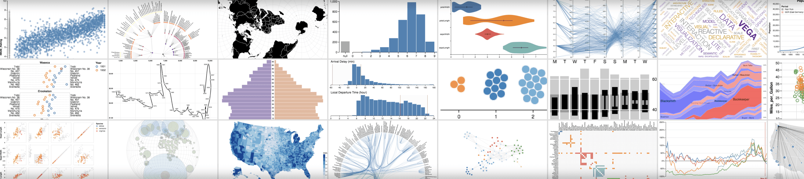
仕組み
1. **データをログする**: スクリプトから [設定](/ja/products/wandb/track/config) とサマリーデータをログします。
2. **チャートをカスタマイズする**: [GraphQL](https://graphql.org) クエリを使って、ログしたデータを取り込みます。クエリの結果は、可視化文法である [Vega](https://vega.github.io/vega/) で可視化します。
3. **チャートをログする**: スクリプトから `wandb.plot_table()` で独自のプリセットを呼び出します。
 期待したデータが表示されない場合は、目的の列が選択した run でログされていない可能性があります。チャートを保存して run テーブルに戻り、**目** のアイコンで選択中の run を確認してください。
スクリプトからチャートをログする
以下のセクションでは、トレーニングスクリプトから直接チャートをログする 2 つの方法について説明します。1 つは一般的な可視化に対応した組み込みのチャートプリセット、もう 1 つは独自の Vega 仕様を再利用できるカスタムプリセットです。
組み込みプリセット
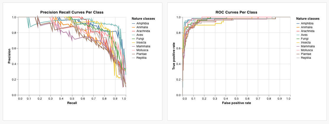
W\&B には、スクリプトから直接ログできる組み込みのチャートプリセットがいくつか用意されています。折れ線グラフ、散布図、棒グラフ、ヒストグラム、PR 曲線、ROC 曲線などがあります。
`wandb.plot.line()`
カスタム折れ線グラフをログします。折れ線グラフは、任意の x 軸と y 軸上にある、順序付けられて互いに接続されたポイント (x,y) のリストです。
```python theme={"system"}
with wandb.init() as run:
data = [[x, y] for (x, y) in zip(x_values, y_values)]
table = wandb.Table(data=data, columns=["x", "y"])
run.log(
{
"my_custom_plot_id": wandb.plot.line(
table, "x", "y", title="Custom Y vs X Line Plot"
)
}
)
```
折れ線グラフは、任意の 2 つの次元で曲線をログします。2 つの値のリストを互いに対してプロットする場合、リスト内の値の数は完全に一致している必要があります (たとえば、各ポイントには x と y の両方が必要です)。
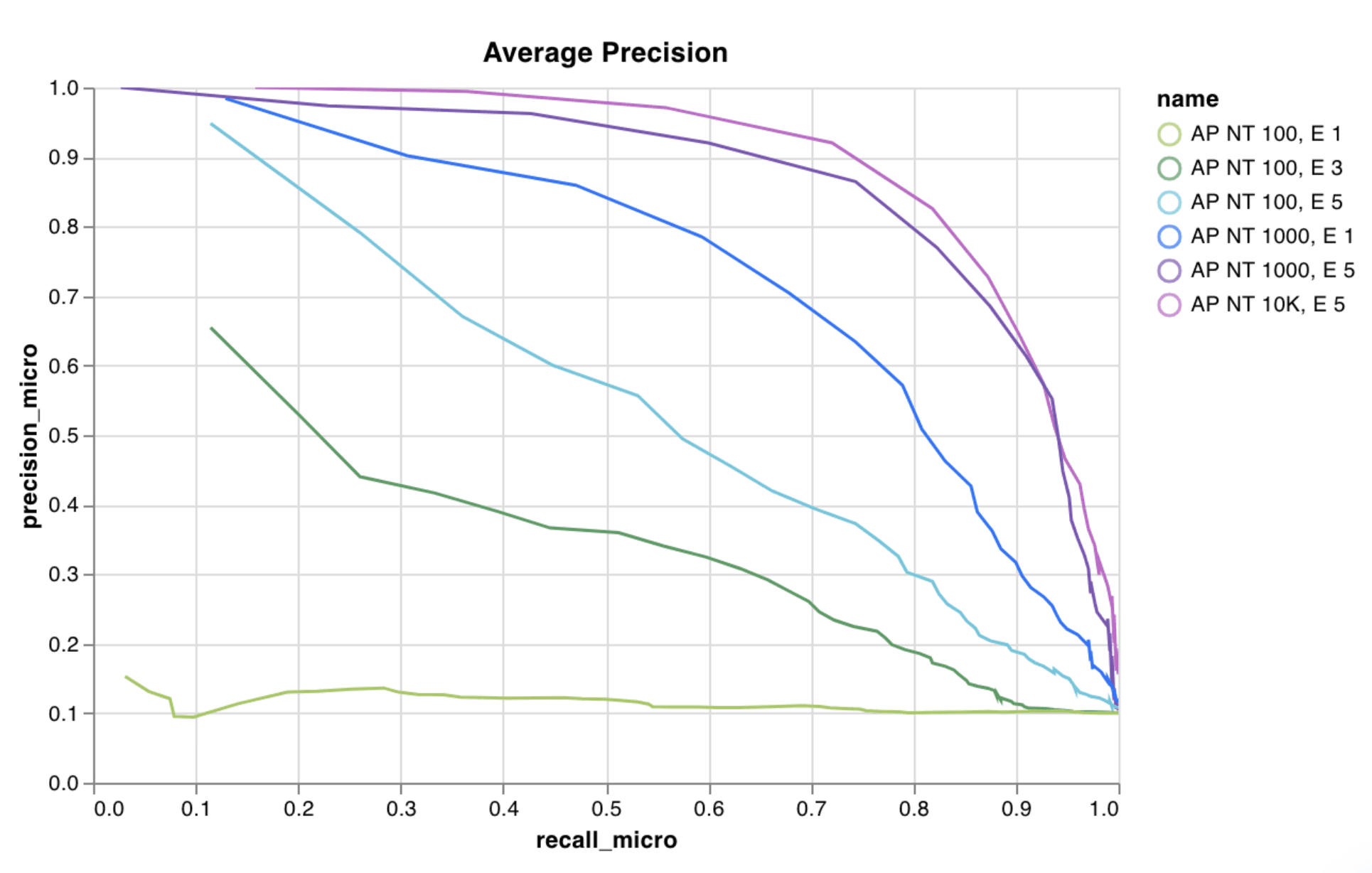 [サンプルの report を参照する](https://forge.coreweave.com/wandb/wandb/plots/reports/Custom-Line-Plots--VmlldzoyNjk5NTA)か、[サンプルの Google Colab ノートブックを試してみてください](https://tiny.cc/custom-charts)。
`wandb.plot.scatter()`
カスタム散布図をログします。散布図は、任意の 2 軸 x と y 上にプロットされたポイント (x, y) のリストです。
```python theme={"system"}
with wandb.init() as run:
data = [[x, y] for (x, y) in zip(class_x_prediction_scores, class_y_prediction_scores)]
table = wandb.Table(data=data, columns=["class_x", "class_y"])
run.log({"my_custom_id": wandb.plot.scatter(table, "class_x", "class_y")})
```
これを使用すると、任意の 2 つの次元で散布図のポイントをログできます。2 つのリストの値を互いにプロットする場合は、各リストの値の数が完全に一致している必要があります (たとえば、各ポイントには x と y の両方が必要です)。
[サンプルの report を参照する](https://forge.coreweave.com/wandb/wandb/plots/reports/Custom-Line-Plots--VmlldzoyNjk5NTA)か、[サンプルの Google Colab ノートブックを試してみてください](https://tiny.cc/custom-charts)。
`wandb.plot.scatter()`
カスタム散布図をログします。散布図は、任意の 2 軸 x と y 上にプロットされたポイント (x, y) のリストです。
```python theme={"system"}
with wandb.init() as run:
data = [[x, y] for (x, y) in zip(class_x_prediction_scores, class_y_prediction_scores)]
table = wandb.Table(data=data, columns=["class_x", "class_y"])
run.log({"my_custom_id": wandb.plot.scatter(table, "class_x", "class_y")})
```
これを使用すると、任意の 2 つの次元で散布図のポイントをログできます。2 つのリストの値を互いにプロットする場合は、各リストの値の数が完全に一致している必要があります (たとえば、各ポイントには x と y の両方が必要です)。
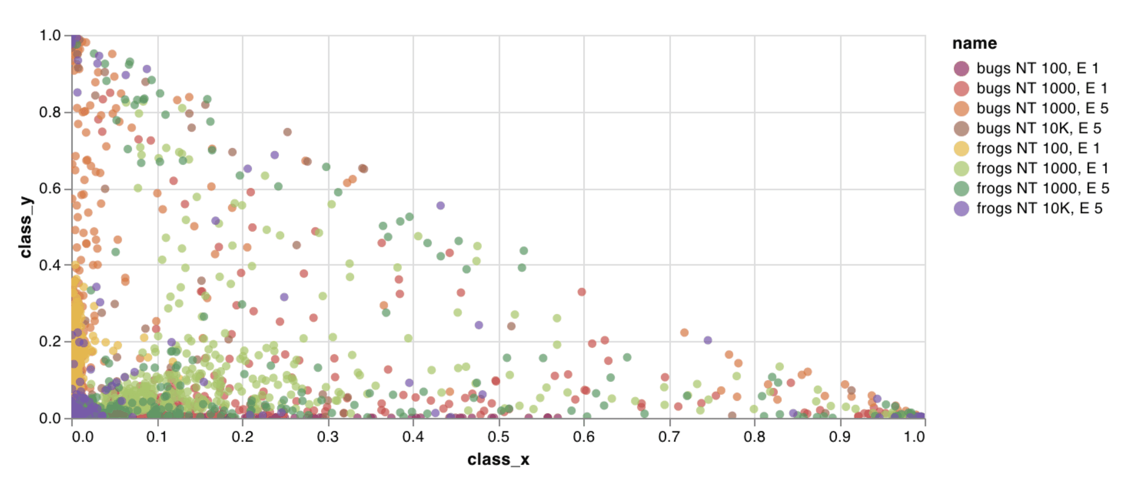 [report の例を見る](https://forge.coreweave.com/wandb/wandb/plots/reports/Custom-Scatter-Plots--VmlldzoyNjk5NDQ)か、[Google Colab のサンプルノートブックを試してみてください](https://tiny.cc/custom-charts)。
`wandb.plot.bar()`
カスタム棒グラフ (ラベル付きの値のリストを棒で表したもの) をログします。
```python theme={"system"}
with wandb.init() as run:
data = [[label, val] for (label, val) in zip(labels, values)]
table = wandb.Table(data=data, columns=["label", "value"])
run.log(
{
"my_bar_chart_id": wandb.plot.bar(
table, "label", "value", title="Custom Bar Chart"
)
}
)
```
これを使用すると、任意の棒グラフをログできます。なお、リスト内のラベルと値の数は完全に一致している必要があります (つまり、各データポイントにはラベルと値の両方が必要です) 。
[report の例を見る](https://forge.coreweave.com/wandb/wandb/plots/reports/Custom-Scatter-Plots--VmlldzoyNjk5NDQ)か、[Google Colab のサンプルノートブックを試してみてください](https://tiny.cc/custom-charts)。
`wandb.plot.bar()`
カスタム棒グラフ (ラベル付きの値のリストを棒で表したもの) をログします。
```python theme={"system"}
with wandb.init() as run:
data = [[label, val] for (label, val) in zip(labels, values)]
table = wandb.Table(data=data, columns=["label", "value"])
run.log(
{
"my_bar_chart_id": wandb.plot.bar(
table, "label", "value", title="Custom Bar Chart"
)
}
)
```
これを使用すると、任意の棒グラフをログできます。なお、リスト内のラベルと値の数は完全に一致している必要があります (つまり、各データポイントにはラベルと値の両方が必要です) 。
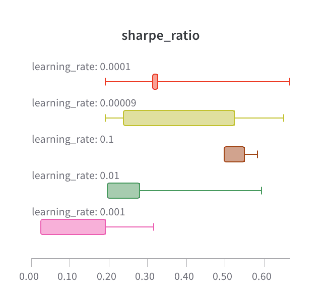 [report の例を参照する](https://forge.coreweave.com/wandb/wandb/plots/reports/Custom-Bar-Charts--VmlldzoyNzExNzk)か、[Google Colab のサンプルノートブックを試してみてください](https://tiny.cc/custom-charts)。
`wandb.plot.histogram()`
カスタムヒストグラム (値のリストを出現回数または頻度に応じてビンに分類したもの) をログします。たとえば、予測の信頼度スコアのリスト (`scores`) があり、その分布を可視化したい場合は次のようにします。
```python theme={"system"}
with wandb.init() as run:
data = [[s] for s in scores]
table = wandb.Table(data=data, columns=["scores"])
run.log({"my_histogram": wandb.plot.histogram(table, "scores", title=None)})
```
これを使用すると、任意のヒストグラムをログできます。`data` はリストのリストで、行と列からなる 2 次元配列を扱えるようになっています。
[report の例を参照する](https://forge.coreweave.com/wandb/wandb/plots/reports/Custom-Bar-Charts--VmlldzoyNzExNzk)か、[Google Colab のサンプルノートブックを試してみてください](https://tiny.cc/custom-charts)。
`wandb.plot.histogram()`
カスタムヒストグラム (値のリストを出現回数または頻度に応じてビンに分類したもの) をログします。たとえば、予測の信頼度スコアのリスト (`scores`) があり、その分布を可視化したい場合は次のようにします。
```python theme={"system"}
with wandb.init() as run:
data = [[s] for s in scores]
table = wandb.Table(data=data, columns=["scores"])
run.log({"my_histogram": wandb.plot.histogram(table, "scores", title=None)})
```
これを使用すると、任意のヒストグラムをログできます。`data` はリストのリストで、行と列からなる 2 次元配列を扱えるようになっています。
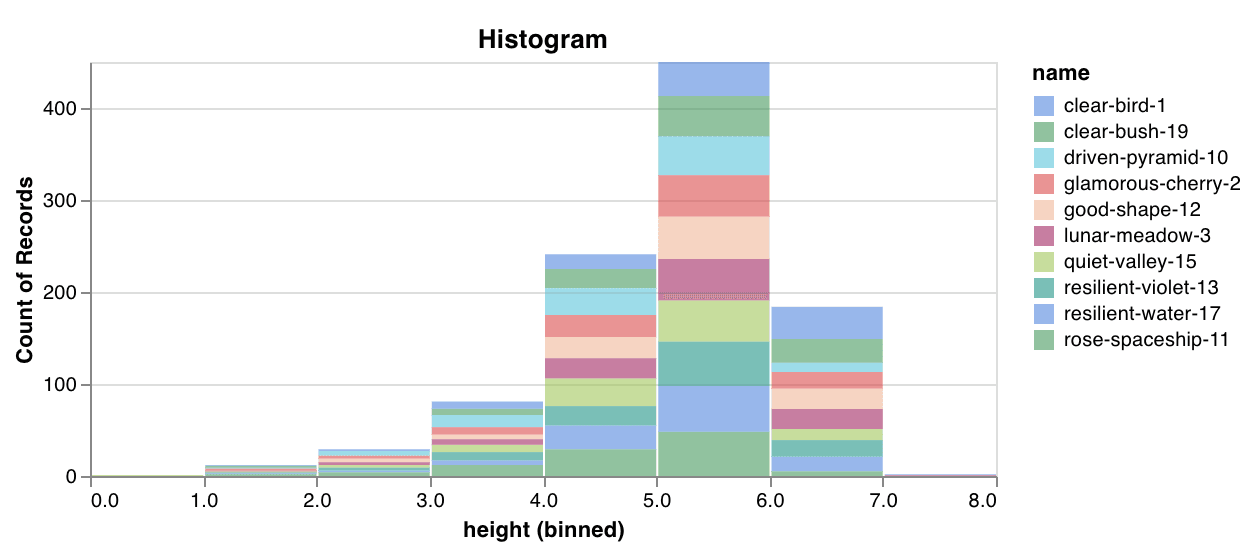 [サンプルの report を参照する](https://forge.coreweave.com/wandb/wandb/plots/reports/Custom-Histograms--VmlldzoyNzE0NzM)か、[サンプルの Google Colab ノートブックを試してみてください](https://tiny.cc/custom-charts)。
`wandb.plot.pr_curve()`
わずか 1 行のコードで[適合率-再現率曲線](https://scikit-learn.org/stable/modules/generated/sklearn.metrics.precision_recall_curve.html#sklearn.metrics.precision_recall_curve)を作成できます。
```python theme={"system"}
with wandb.init() as run:
plot = wandb.plot.pr_curve(ground_truth, predictions, labels=None, classes_to_plot=None)
run.log({"pr": plot})
```
コードから次のデータにアクセスできる場合は、いつでもこれをログできます。
* 一連のサンプルに対するモデルの予測スコア (`predictions`) 。
* それらのサンプルに対応する正解ラベル (`ground_truth`) 。
* `labels` (オプション) :ラベルまたはクラス名のリスト (ラベルインデックス 0 が cat、1 が dog、2 が bird などを表す場合は `labels=["cat", "dog", "bird"...]`) 。
* `classes_to_plot` (オプション) :プロットで可視化するラベルのサブセット (リスト形式) 。
[サンプルの report を参照する](https://forge.coreweave.com/wandb/wandb/plots/reports/Custom-Histograms--VmlldzoyNzE0NzM)か、[サンプルの Google Colab ノートブックを試してみてください](https://tiny.cc/custom-charts)。
`wandb.plot.pr_curve()`
わずか 1 行のコードで[適合率-再現率曲線](https://scikit-learn.org/stable/modules/generated/sklearn.metrics.precision_recall_curve.html#sklearn.metrics.precision_recall_curve)を作成できます。
```python theme={"system"}
with wandb.init() as run:
plot = wandb.plot.pr_curve(ground_truth, predictions, labels=None, classes_to_plot=None)
run.log({"pr": plot})
```
コードから次のデータにアクセスできる場合は、いつでもこれをログできます。
* 一連のサンプルに対するモデルの予測スコア (`predictions`) 。
* それらのサンプルに対応する正解ラベル (`ground_truth`) 。
* `labels` (オプション) :ラベルまたはクラス名のリスト (ラベルインデックス 0 が cat、1 が dog、2 が bird などを表す場合は `labels=["cat", "dog", "bird"...]`) 。
* `classes_to_plot` (オプション) :プロットで可視化するラベルのサブセット (リスト形式) 。
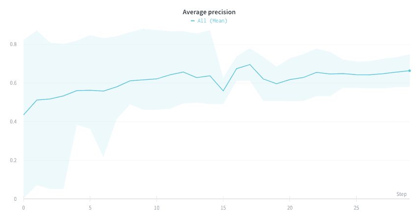 [report の例を見る](https://forge.coreweave.com/wandb/wandb/plots/reports/Plot-Precision-Recall-Curves--VmlldzoyNjk1ODY)か、[Google Colab のサンプルノートブックを試す](https://colab.research.google.com/drive/1mS8ogA3LcZWOXchfJoMrboW3opY1A8BY?usp=sharing)ことができます。
`wandb.plot.roc_curve()`
[ROC 曲線](https://scikit-learn.org/stable/modules/generated/sklearn.metrics.roc_curve.html#sklearn.metrics.roc_curve)を 1 行で作成できます。
```python theme={"system"}
with wandb.init() as run:
# ground_truth は正解ラベルのリスト、predictions は予測スコアのリストです
ground_truth = [0, 1, 0, 1, 0, 1]
predictions = [0.1, 0.4, 0.35, 0.8, 0.7, 0.9]
# ROC 曲線のプロットを作成します
# labels はクラス名のリスト(オプション)、classes_to_plot はそのうち可視化するラベルのサブセット(オプション)です
plot = wandb.plot.roc_curve(
ground_truth, predictions, labels=None, classes_to_plot=None
)
run.log({"roc": plot})
```
コードから次の情報にアクセスできる場合は、いつでもこのチャートをログできます。
* 一連のサンプルに対するモデルの予測スコア (`predictions`)。
* それらのサンプルに対応する正解ラベル (`ground_truth`)。
* `labels` (オプション): ラベル名またはクラス名のリスト (ラベルインデックス 0 が cat、1 が dog、2 が bird などを表す場合は `labels=["cat", "dog", "bird"...]`)。
* `classes_to_plot` (オプション): これらのラベルのうち、プロット上で可視化するサブセット (リスト形式で指定)。
[report の例を見る](https://forge.coreweave.com/wandb/wandb/plots/reports/Plot-Precision-Recall-Curves--VmlldzoyNjk1ODY)か、[Google Colab のサンプルノートブックを試す](https://colab.research.google.com/drive/1mS8ogA3LcZWOXchfJoMrboW3opY1A8BY?usp=sharing)ことができます。
`wandb.plot.roc_curve()`
[ROC 曲線](https://scikit-learn.org/stable/modules/generated/sklearn.metrics.roc_curve.html#sklearn.metrics.roc_curve)を 1 行で作成できます。
```python theme={"system"}
with wandb.init() as run:
# ground_truth は正解ラベルのリスト、predictions は予測スコアのリストです
ground_truth = [0, 1, 0, 1, 0, 1]
predictions = [0.1, 0.4, 0.35, 0.8, 0.7, 0.9]
# ROC 曲線のプロットを作成します
# labels はクラス名のリスト(オプション)、classes_to_plot はそのうち可視化するラベルのサブセット(オプション)です
plot = wandb.plot.roc_curve(
ground_truth, predictions, labels=None, classes_to_plot=None
)
run.log({"roc": plot})
```
コードから次の情報にアクセスできる場合は、いつでもこのチャートをログできます。
* 一連のサンプルに対するモデルの予測スコア (`predictions`)。
* それらのサンプルに対応する正解ラベル (`ground_truth`)。
* `labels` (オプション): ラベル名またはクラス名のリスト (ラベルインデックス 0 が cat、1 が dog、2 が bird などを表す場合は `labels=["cat", "dog", "bird"...]`)。
* `classes_to_plot` (オプション): これらのラベルのうち、プロット上で可視化するサブセット (リスト形式で指定)。
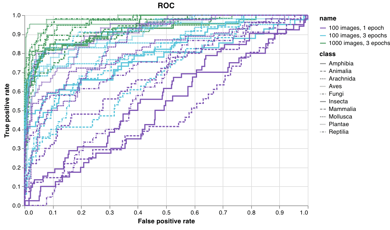 [サンプルの report を見る](https://forge.coreweave.com/wandb/wandb/plots/reports/Plot-ROC-Curves--VmlldzoyNjk3MDE)か、[サンプルの Google Colab ノートブックを試してみてください](https://colab.research.google.com/drive/1_RMppCqsA8XInV_jhJz32NCZG6Z5t1RO?usp=sharing)。
カスタムプリセット
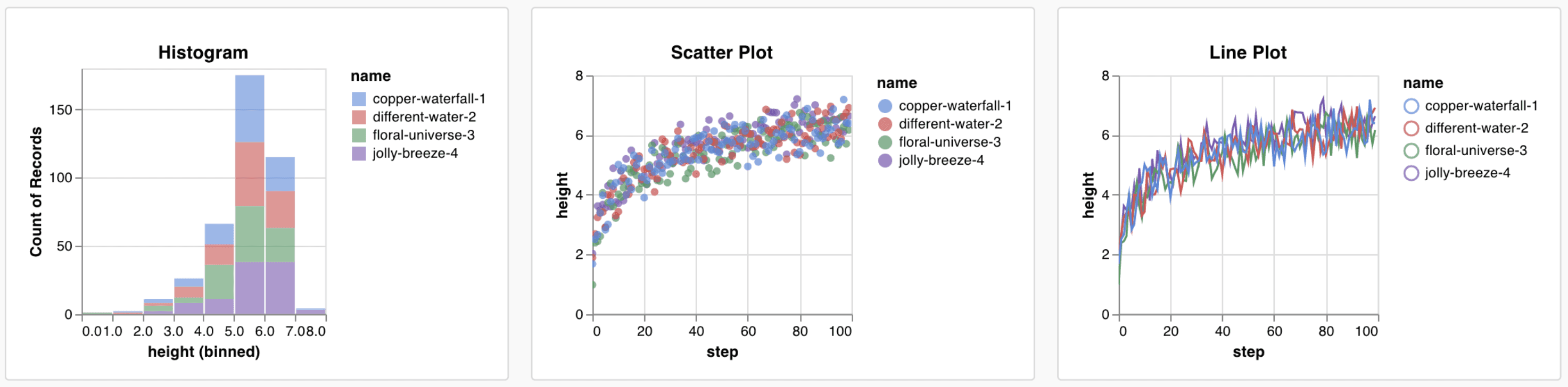
組み込みプリセットを調整するか、新しいプリセットを作成して、チャートを保存します。チャート ID を使用すると、スクリプトから直接そのカスタムプリセットにデータをログできます。[Google Colab のサンプルノートブックを試してみてください](https://tiny.cc/custom-charts)。
```python theme={"system"}
# プロットする列を持つ表を作成します
table = wandb.Table(data=data, columns=["step", "height"])
# 表の列をチャートのフィールドにマッピングします
fields = {"x": "step", "value": "height"}
# 表のデータを新しいカスタム チャート プリセットに反映します
# 自分で保存したチャート プリセットを使用する場合は、vega_spec_name を変更します
my_custom_chart = wandb.plot_table(
vega_spec_name="carey/new_chart",
data_table=table,
fields=fields,
)
```
データをログする
カスタム チャートで何かを可視化するには、まずチャートエディターでクエリできる形式で、元となるデータをスクリプトからログしておく必要があります。スクリプトからは以下のデータタイプをログでき、カスタム チャートで使用できます。
* **Config**: 実験の初期設定 (独立変数) です。トレーニングの開始時に `wandb.Run.config` のキーとしてログした名前付きフィールドがすべて含まれます。例: `wandb.Run.config.learning_rate = 0.0001`
* **Summary**: トレーニング中にログされる単一の値 (結果または従属変数) です。例: `wandb.Run.log({"val_acc" : 0.8})`。トレーニング中に `wandb.Run.log()` で同じキーに複数回書き込んだ場合、summary にはそのキーの最終値が設定されます。
* **History**: ログされたスカラーの完全な時系列には、`history` フィールドを通じてクエリからアクセスできます。
* **summaryTable**: 複数の値のリストをログする必要がある場合は、`wandb.Table()` を使用してデータを保存し、カスタムパネルでクエリします。
* **historyTable**: 履歴データを確認する必要がある場合は、カスタム チャートのパネルで `historyTable` をクエリします。`wandb.Table()` を呼び出すか、カスタム チャートをログするたびに、その ステップ の履歴に新しい表が作成されます。
カスタム表をログする
`wandb.Table()` を使用して、データを 2 次元配列としてログします。通常、この表の各行が 1 つのデータポイントに対応し、各列はプロットする各データポイントの関連フィールドまたは次元を表します。カスタムパネルを設定する際は、`wandb.Run.log()` に渡したキー名 (次の例では `custom_data_table`) で表全体にアクセスできます。個々のフィールドには列名 (`x`、`y`、`z`) でアクセスできます。表は実験中の複数のタイムステップでログできます。各表の最大サイズは 10,000 行です。[Google Colab のサンプルノートブックを試す](https://tiny.cc/custom-charts)。
```python theme={"system"}
with wandb.init() as run:
# データをカスタム表としてログする
my_custom_data = [[x1, y1, z1], [x2, y2, z2]]
run.log(
{"custom_data_table": wandb.Table(data=my_custom_data, columns=["x", "y", "z"])}
)
```
チャートをカスタマイズする
データをログした後、ログされた値のうちどれを取り込み、どのようにレンダリングするかを選んで、W\&B アプリでチャートを作成します。まず新しいカスタム チャートを追加し、クエリを編集して表示中の run からデータを選択します。クエリでは [GraphQL](https://graphql.org) を使用して、run の config、summary、history フィールドからデータを取得します。
作成したいチャートを説明して、ARIA にカスタム チャートを作成してもらうこともできます。プロジェクトの Workspace から ARIA を開き、作成したいチャートを説明してください。
GraphQL クエリを作成する
カスタム チャートエディターは、プロジェクトの Workspace または report で選択した run に対して GraphQL クエリを実行します。クエリエディターで必要なフィールドを追加してください。`config`、`summary`、`history`、`summaryTable`、`historyTable` から選択できるため、ほとんどの場合、クエリを一から記述する必要はありません。
クエリ内の各ソースは、それぞれ異なるログ済みデータに対応しています。
* **Config** は [run 設定](/ja/products/wandb/track/config) の値 (ハイパーパラメーターやその他の設定) を取得します。
* **Summary** は [summary](/ja/products/wandb/track/log) の値を取得します。デフォルトでは、`wandb.Run.log()` でログしたキーの summary には、そのキーに最後に書き込まれた値が保持されます。別の集計方法を使用するには、`"min"`、`"max"`、`"mean"`、`"best"`、`"none"` のいずれかを指定して `wandb.Run.define_metric(..., summary=...)` を呼び出します。値を直接設定するには、`wandb.Run.summary["key"] = value` のように代入します。
* **History** は run の履歴からスカラーの時系列 (たとえば、各 ステップ の `loss` や `accuracy`) を取得します。最終的な値だけでなく曲線全体が必要な場合は、**history** を使用します。
* **`summaryTable`** は run の summary から [`wandb.Table`](/ja/products/wandb/ref/python/data-types/table) を読み込みます。対象の表が run 上に単一のスナップショットとして保存されている場合 (たとえば、最後に一度だけログする混同行列) に使用します。
* **`historyTable`** は run の履歴から [`wandb.Table`](/ja/products/wandb/ref/python/data-types/table) を読み込みます。`wandb.Run.log()` で表をログするたびに、その表を含む ステップ が run の履歴に追加されます。表が時間とともに変化する場合や、カスタム チャートエディターでステップセレクターを有効にしたい場合は、**`historyTable`** を使用します ([カスタム チャートでステップスライダーを表示するにはどうすればよいですか?](/ja/support/models/articles/how-do-you-show-a-step-slider-in-a-custo) を参照してください)。
**`summaryTable`** と **`historyTable`** では、**`tableKey`** に [`wandb.Table`](/ja/products/wandb/ref/python/data-types/table) 内の列名ではなく、`wandb.Run.log()` 内で使用した辞書のキーを指定します。
一般的なケースの例を以下に示します。
* 各 ステップ でログする表の列をプロットする場合 (たとえば PR 曲線): **`historyTable`** を追加し、**`tableKey`** にログしたキー (たとえば `pr_curve`) を指定してから、**Chart fields** で表の列をマッピングします。[カスタム チャートのチュートリアル](/ja/products/wandb/app/features/custom-charts/walkthrough) を参照してください。
* summary に保存されている表の列をプロットする場合 (たとえば composite ヒストグラム 用のクラススコア): **`summaryTable`** を追加し、**`tableKey`** にそのキー (チュートリアルでは `class_scores`) を指定します。[Bonus: composite ヒストグラム](/ja/products/wandb/app/features/custom-charts/walkthrough#bonus-composite-histograms) を参照してください。
* トレーニングステップごとのスカラーのメトリクスをプロットする場合: **history** からメトリクスを追加します。**summary** からのみ追加すると、チャートには run ごとに 1 つの値しか表示されません。
**Chart field 名**
クエリの実行後、**Chart fields** には Vega spec にバインドできる列が一覧表示されます。名前は多くの場合 `runSets_` で始まり、選択したクエリフィールドに基づいて決まります。手動で入力せず、各 `${field:...}` プレースホルダーの横にあるドロップダウンから選択してください。
列が表示されない場合は、選択した run にそのキーが存在するかを確認してください。また、Run page を開いてデータのログ方法を確かめ、**`summaryTable`** と **`historyTable`** のどちらがそのログ方法に合っているかを確認してください。
カスタム チャートでは、この GraphQL ベースのパネルクエリを使用します。[クエリパネル](/ja/products/wandb/app/features/panels/query-panels) は別の式言語を使用するため、別のドキュメントで説明しています。
カスタム可視化
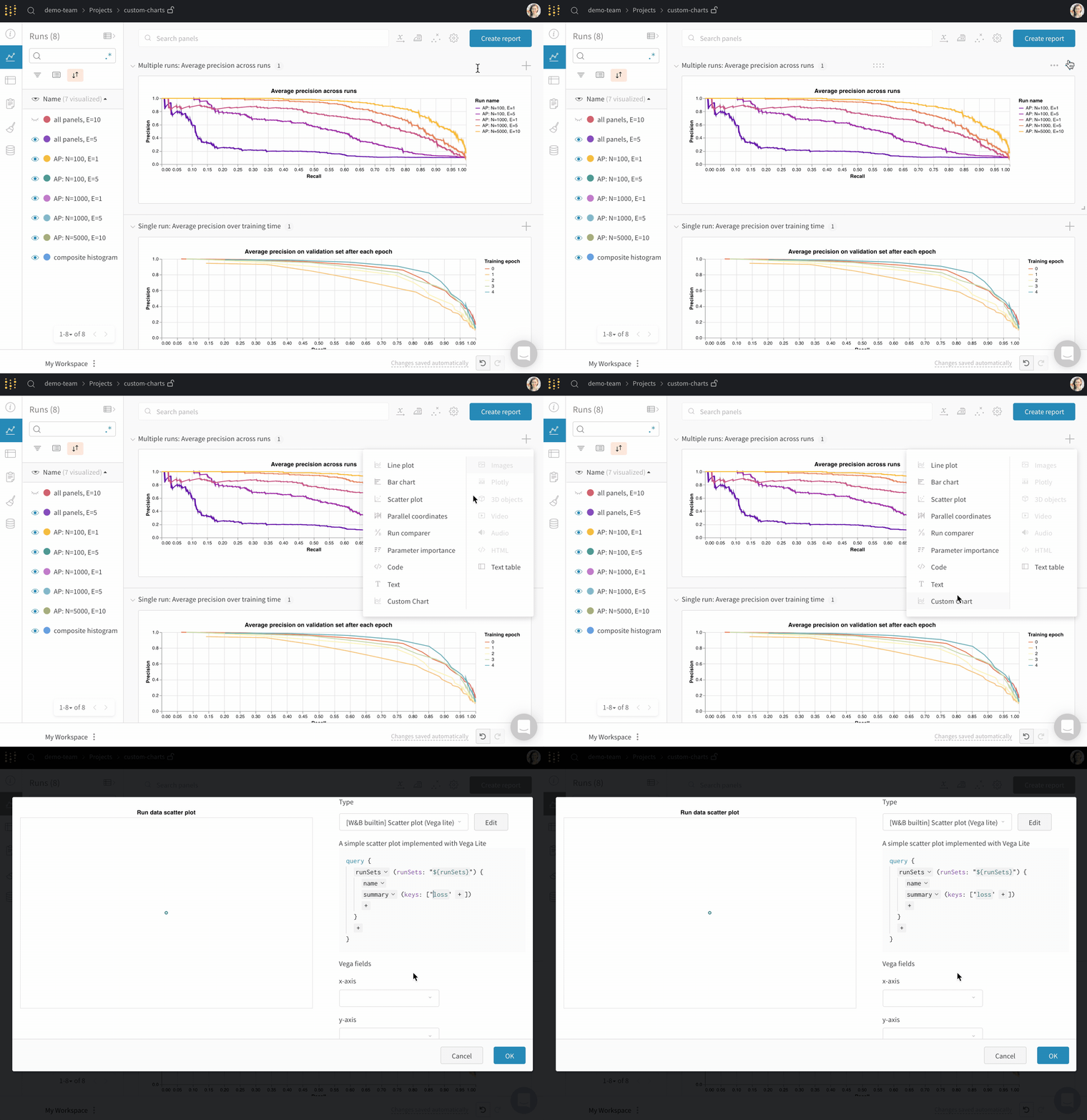
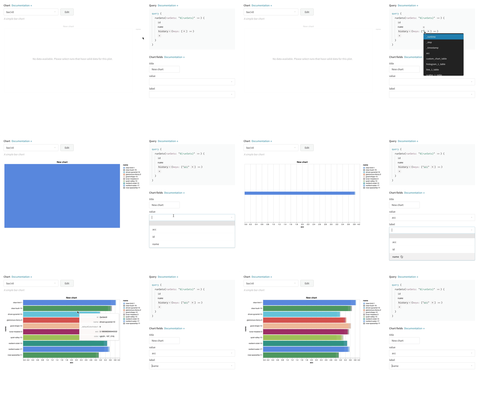
右上の **Chart** を選択すると、デフォルトのプリセットから始められます。次に、**Chart fields** を選択し、クエリで取得したデータをチャートの対応するフィールドにマッピングします。
次の画像は、メトリクスを選択して棒グラフのフィールドにマッピングする方法を示しています。
Vega を編集する
パネル上部の **Edit** をクリックすると、[Vega](https://vega.github.io/vega/) の編集モードに切り替わります。ここでは、UI にインタラクティブなチャートを作成する [Vega 仕様](https://vega.github.io/vega/docs/specification/) を定義できます。チャートのあらゆる要素を変更できます。たとえば、タイトルを変更したり、別の配色を選択したり、曲線を線でつなぐ代わりに一連のポイントとして表示したりできます。また、Vega の transform を使用して値の配列をビンに分割し、ヒストグラムを作成するなど、データ自体に変更を加えることもできます。パネルのプレビューはインタラクティブに更新されるため、Vega spec やクエリを編集しながら変更の結果を確認できます。詳細については、[Vega のドキュメントとチュートリアル](https://vega.github.io/vega/)を参照してください。
**フィールド参照**
W\&B からチャートにデータを取り込むには、Vega spec の任意の場所に `"${field:}"` 形式のテンプレート文字列を追加します。これにより、右側の **Chart fields** 領域にドロップダウンが追加され、Vega にマッピングするクエリ結果の列を選択できるようになります。
フィールドのデフォルト値を設定するには、次の構文を使用します: `"${field::}"`
チャートのプリセットを保存する
プリセットを保存すると、同じ Vega 定義を毎回作り直さなくても、複数のパネルや project で再利用できます。特定の可視化パネルに変更を適用するには、モーダル下部のボタンを使用します。また、Vega spec を保存して、project 内の別の場所で再利用することもできます。再利用可能なチャート定義を保存するには、Vega エディター上部の **Save as** をクリックし、プリセットに名前を付けます。
Reports とガイド
以下の report では、カスタム チャートの実践的な活用方法について、エンドツーエンドのサンプルやより踏み込んだ解説を紹介しています。
* [The W\&B Machine Learning Visualization IDE](https://forge.coreweave.com/wandb/wandb/posts/reports/The-W-B-Machine-Learning-Visualization-IDE--VmlldzoyNjk3Nzg)
* [Attention ベースの NLP モデルを可視化する](https://forge.coreweave.com/wandb/kylegoyette/gradientsandtranslation2/reports/Visualizing-NLP-Attention-Based-Models-Using-Custom-Charts--VmlldzoyNjg2MjM)
* [Attention が勾配の流れに与える影響を可視化する](https://forge.coreweave.com/wandb/kylegoyette/gradientsandtranslation/reports/Visualizing-The-Effect-of-Attention-on-Gradient-Flow-Using-Custom-Charts--VmlldzoyNjg1NDg)
* [任意の曲線をログする](https://forge.coreweave.com/wandb/stacey/presets/reports/Logging-Arbitrary-Curves--VmlldzoyNzQyMzA)
一般的なユースケース
カスタム チャートは、デフォルトのパネルでは表示したい内容を表現できない場合に役立ちます。たとえば、次のような用途があります。
* エラーバー付きの棒グラフをカスタマイズする
* 独自の x-y 座標が必要なモデルの検証メトリクス (適合率-再現率曲線など) を表示する
* 2 つの異なるモデルまたは実験のデータ分布を、ヒストグラムとして重ねて表示する
* トレーニング中の複数のポイントで取得したスナップショットを使って、メトリクスの推移を表示する
* W\&B にはまだない独自の可視化を作成し、他のユーザーと共有する
## Related topics
- [カスタム チャートの概要](/ja/products/wandb/ref/python/custom-charts.md)